 Mary Faith B. Unabia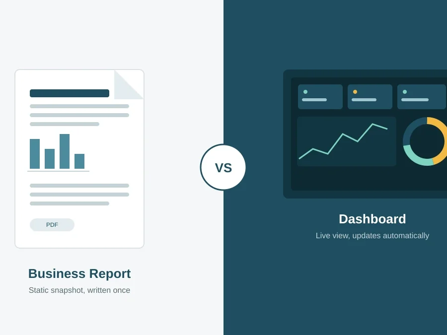
Every organization runs on information, but not every organization presents that information the same way. When leaders ask for “the numbers,” they might mean a polished PDF summarizing last quarter’s performance, or they might mean a live screen they can click through whenever a question comes up.
This is the heart of the dashboard vs business report debate, and getting the answer wrong can waste hours of analyst time or leave decision-makers staring at data they do not know how to use.
In this blog, we will break down what each format actually is, where each one shines, and how to decide which one your business needs.
What Is a Business Report?
A business report is a structured document that presents data, analysis, and conclusions about a specific topic, time period, or decision. Reports are typically static: once published, the numbers reflect a fixed moment in time, such as “Q2 2026 Sales Performance” or “Annual Marketing ROI Review.”
According to Harvard Business School Online, organizations that build a disciplined, data-driven decision-making process consistently outperform those that rely on intuition alone. A well-written report is often the vehicle that carries that data to the people who need to act on it.
When people frame the dashboard vs business report question, they’re really asking which format fits a decision that doesn’t change hour to hour.
Business reports typically include:
- A written narrative or executive summary
- Supporting tables, charts, and appendices
- Recommendations or conclusions based on the data
- A defined reporting period (weekly, monthly, quarterly, annual)
Because they are written and reviewed by an analyst before distribution, reports are well suited to formal communication — board packets, compliance filings, or year-end reviews where accuracy and narrative context matter more than real-time updates.
What Is a Dashboard?
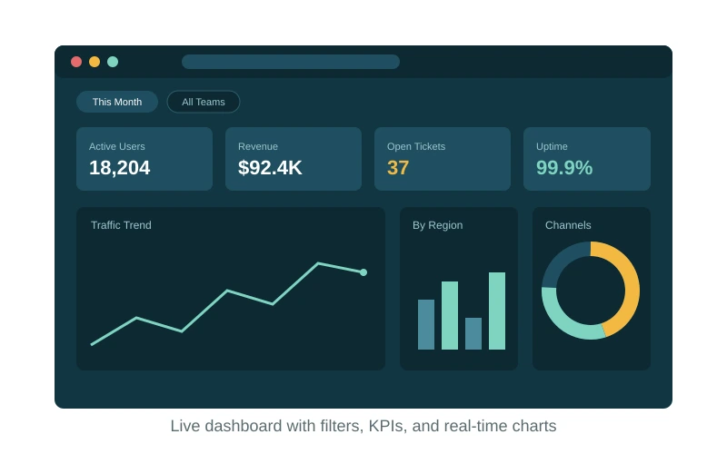
A dashboard is an interactive, visual interface that displays key metrics and KPIs, usually pulling from live or frequently refreshed data sources. Instead of a fixed narrative, a dashboard lets users filter, drill down, and explore the numbers themselves. Rather than reading someone else’s summary of what happened, the viewer works directly with the underlying data and can answer follow-up questions on the spot.
Data2Stats’ data analysis services frequently include dashboard builds precisely because they turn scattered raw data into something teams can monitor continuously rather than wait to receive.
Dashboards are typically built on top of a connected data source, such as a database, spreadsheet, or cloud data warehouse, and refresh automatically on a schedule or in real time. Because the data connection does most of the work, a dashboard can be checked once a day or once an hour without anyone having to manually rebuild it.This makes dashboards especially useful for tracking operational health, since the same view stays accurate as new data comes in.
Most dashboards are also role-aware. A sales manager might see pipeline and quota progress, while a support lead sees ticket volume and response times, all pulled from the same underlying dataset but filtered to what matters for each person. This flexibility is part of what separates a dashboard from a report: the same dashboard can serve several audiences, while a report is usually written for one.
Common dashboard features include:
- Real-time or near-real-time data refresh
- Interactive charts, filters, and drill-downs
- Customizable views for different roles or departments
- Alerts or thresholds that flag when a metric moves out of range
If your team wants to check “how are we doing right now” without waiting for someone to compile a document, a dashboard is generally the better fit.
Dashboard vs. Business Report: Key Differences
While both formats can pull from the exact same underlying data, the way they present it, and how often that presentation stays accurate, is what really separates a dashboard from a business report. A report is essentially a photograph of your data at one moment; a dashboard is closer to a window you can keep looking through. That distinction shapes everything else: how the data is formatted, who ends up using it, and how much upkeep it needs.
The table below summarizes how the two formats differ across the factors that matter most when choosing a reporting solution.
| Factor | Business Report | Dashboard |
|---|---|---|
| Data timing | Static, point-in-time snapshot | Live or frequently refreshed |
| Format | Written document (PDF, Word, slides) | Interactive visual interface |
| Interactivity | None, fixed layout | Filters, drill-downs, custom views |
| Best for | Formal reviews, compliance, storytelling | Ongoing monitoring, operational tracking |
| Update effort | Manual, recreated each cycle | Automated once built |
| Audience | Executives, boards, external stakeholders | Analysts, managers, day-to-day operators |
Two of these differences tend to matter most in practice. The first is data timing: a report is only as current as the day it was written, so by the time it reaches a reader, some of the numbers may have already shifted. A dashboard sidesteps that problem entirely by pulling fresh data on a schedule or in real time. The second is audience: reports are built for people who need a finished, formal document (executives, boards, external stakeholders), while dashboards are built for people who need to check in often and explore the data themselves (analysts, managers, day-to-day operators).
In short, a dashboard vs business report choice usually comes down to whether your audience needs a narrative they can read once, or a living and interactive tool they’ll return to again and again.
When Each One Works Best
When a Business Report Makes Sense
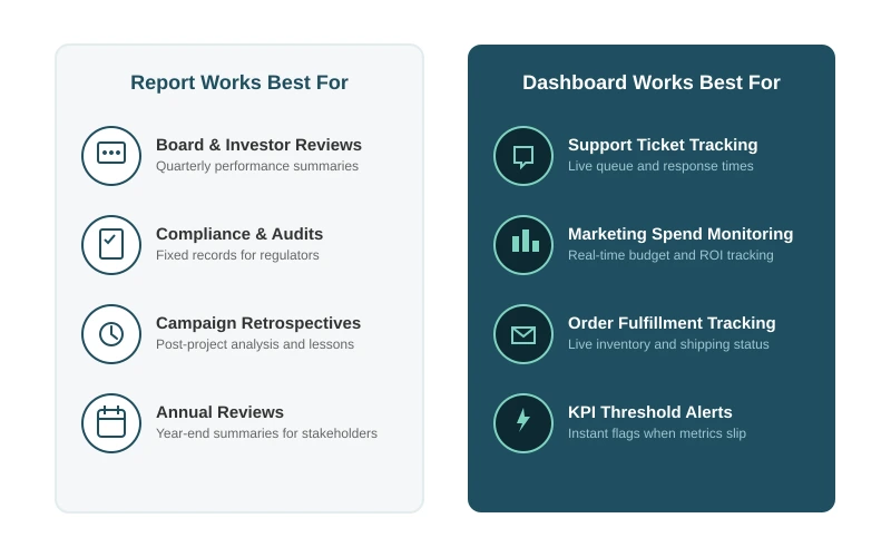
Reports remain the right call when a decision needs context, not just numbers. A quarterly board presentation, an annual audit summary, or a post-campaign retrospective all benefit from an analyst’s written interpretation alongside the data. Qlik’s overview of dashboard reporting frames static reports as tools that summarize what already happened — exactly the strength you want for a formal, point-in-time review.
When a Dashboard Makes Sense
Dashboards excel when metrics change frequently and multiple people need to monitor them without waiting for a scheduled report. A support team tracking open tickets, a marketing team watching campaign spend, or an operations team monitoring order fulfillment all benefit from live visibility. For a hands-on example of building this kind of flexibility into a live view, see a walkthrough on creating smarter dashboards using parameters, which shows how a single dashboard can serve several audiences at once.
Pros and Cons of Each Reporting Format
Business Report Pros and Cons
Pros
- Provides context and narrative, not just numbers
- Easy to distribute as a fixed, citable document
- Well suited for compliance and formal record-keeping
Cons
- Becomes outdated as soon as new data arrives
- Time-consuming to produce and update manually
- Limited interactivity for the reader
Dashboard Pros and Cons
Pros
- Reflects current data, often in real time
- Lets users explore the data themselves
- Reduces the manual work of recreating reports each cycle
Cons
- Can overwhelm users without careful design
- Requires reliable, well-governed data pipelines
- Less effective for detailed narrative or formal sign-off, and access needs to be properly managed. Data2Stats’ guide to Row-level security in Looker Studio covers how to keep sensitive dashboard data restricted to the right viewers
Choosing the Right Business Reporting Solution
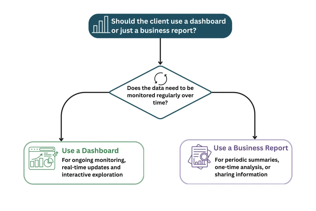
There’s no single right answer to the dashboard vs business report question — most growing businesses do not have to pick just one. A common and effective setup pairs a dashboard for day-to-day monitoring with a periodic report for formal review and storytelling. Before deciding, ask:
- Who is the audience? Executives and external stakeholders often prefer a report; operational teams usually prefer a dashboard.
- How often does the data change? Fast-moving metrics belong on a dashboard; slower, cyclical metrics are fine in a report.
- Is a written recommendation required? If a decision needs formal sign-off or narrative justification, a report is usually necessary.
- What’s the maintenance capacity? Dashboards require upfront setup and clean data pipelines; reports require recurring manual effort.
If your business is scaling past spreadsheets and one-off reports, it may be time to explore how a dedicated data science and AI build can automate the reporting layer entirely , turning both dashboards and reports into a single, well-governed data workflow instead of two disconnected efforts. BigQuery-powered Daily Pulse Report walkthrough is a good example of what that combined approach can look like in practice.
Conclusion
The dashboard vs business report decision isn’t about picking a winner. It’s about matching the format to how your team actually uses information. Reports give you narrative and formal record-keeping; dashboards give you live visibility and self-service exploration, and neither is inherently better since they solve different problems. If your team spends more time explaining decisions after the fact than tracking them as they happen, a report is doing its job; if people keep asking “what’s happening right now” and waiting on someone to find out, that’s usually a sign a dashboard is missing.
Most organizations end up needing both: a dashboard for the metrics that change daily, and a report for the moments that call for a formal, written record.
The real work isn’t choosing one format forever. It’s checking in periodically as your business grows, since the reporting setup that worked for a five-person team rarely fits the same way once there are ten teams pulling from the same data. Revisiting that question every so often, rather than settling it once and forgetting it, is what keeps a reporting solution useful instead of just familiar.