 Chauncey Adrian G. Peña
Data visualizations play an essential role in decision-making, especially in business, by presenting data in a clear yet intuitive manner. Rather than overwhelming audiences with raw numbers, data visualization presents key information that may otherwise go unnoticed. In turn, this enables both technical and non-technical stakeholders to make informed, data-driven decisions.
Businesses often combine data visualization with Data Analysis to uncover meaningful insights and support more informed decision-making across different industries.
In this blog, we will explore why data visualization matters, the most common chart types, best practices, and how it supports evidence-based, data-driven business decision-making.
What is Data Visualization?
Data visualization is the process of turning raw datasets into meaningful visual storytelling. Through graphical representations, such as charts and graphs, it uncovers patterns, trends, and relationships buried deep within complex datasets. This provides meaningful insights, all while making information easier to understand.
Why Visualize Data?
Businesses collect enormous amounts of data every day, from sales records and customer feedback to website traffic and financial reports. However, raw data alone doesn’t provide much value unless it can be understood.
Imagine looking through thousands of rows in a spreadsheet just to find your best-selling product. It could take hours. Now imagine the same information displayed in a dashboard with charts and graphs. In just a few seconds, the trends become much clearer. This is why data visualization is important.
Why? It helps businesses:
- Understand complex information more easily
- Identify trends and patterns
- Detect unusual results or problems
- Improve communication across teams
- Support faster, data-driven decisions
For example, a retail business can compare sales across different branches using a bar chart, while a hospital can monitor patient admissions through dashboards. Data visualization helps such institutions make quicker and more informed decisions.
To see how these techniques are applied in real business settings, you can explore our Portfolio at Data2Stats, where data analysis and visualization are used to address practical business challenges.
Popular Chart Types
Choosing the right chart is important because each type is designed to communicate data in a different manner. According to Tableau, different visualizations serve different purposes, so selecting the appropriate chart helps audiences understand the information more easily.
Shown below are some of the most commonly used visualization types in business:
1. Bar Charts
Bar charts are used to compare values across different categories.
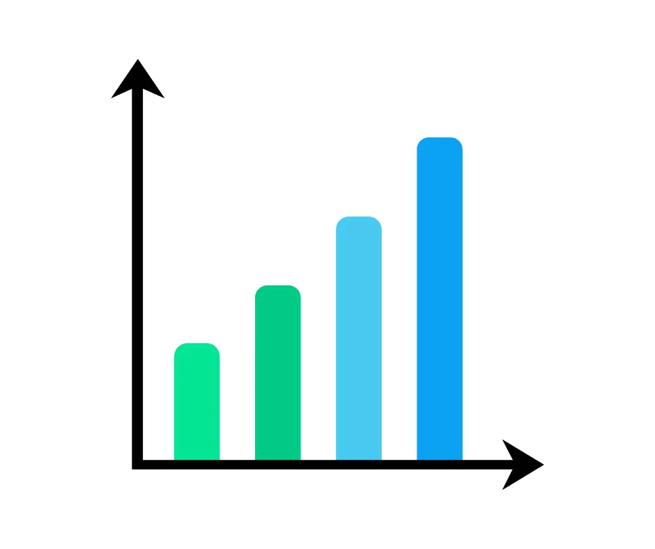
They are one of the most common chart types in business because they make it easy to compare information such as product sales, department performance, or revenue across different locations.
2. Line Charts
Line charts are best for showing trends over time.
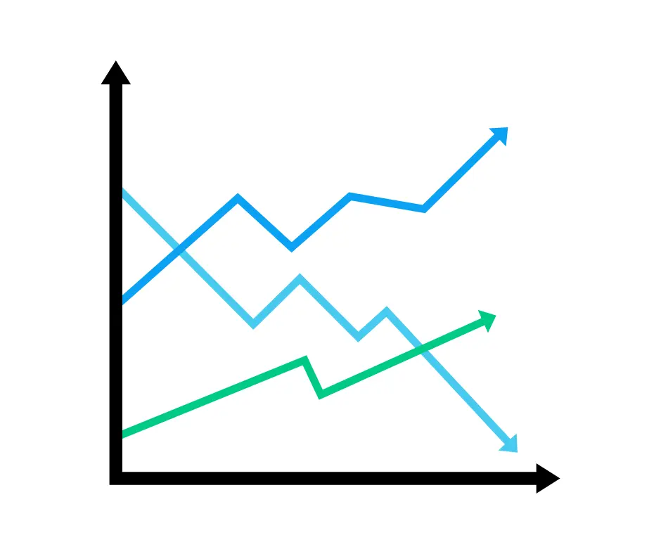
Businesses often use them to monitor monthly sales, website traffic, customer growth, or other performance indicators. They are especially useful for identifying increases, decreases, or recurring patterns.
3. Pie Charts
Pie charts show how different categories contribute to the whole.
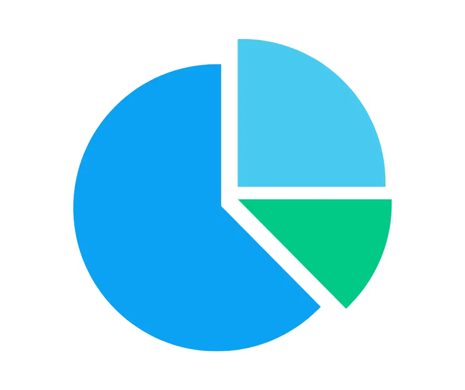
They are best used when comparing only a few categories, let’s say market share or budget allocation.
4. Scatter Plots
Scatterplots are used to examine the relationship between two variables.
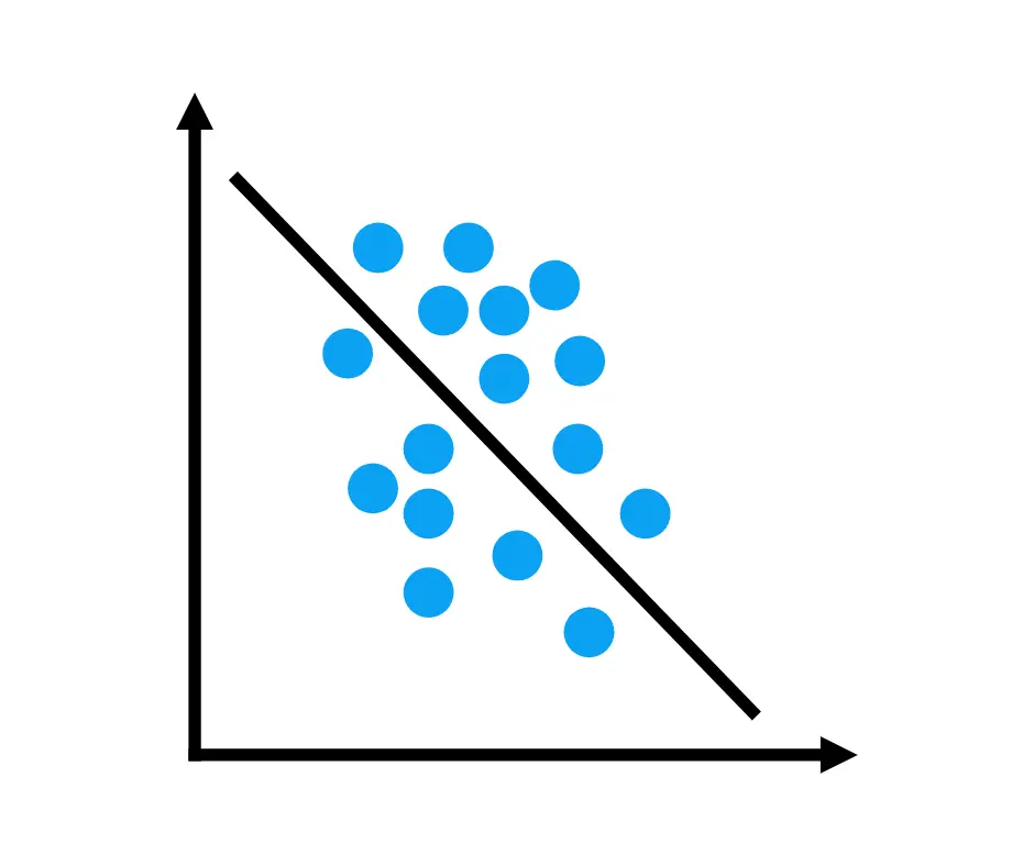
They help businesses identify potential correlations, such as whether higher advertising spending is associated with higher sales or whether employee experience is related to productivity.
5. Treemap
Treemaps display hierarchical data using rectangles of different sizes.

Larger rectangles represent larger values, making treemaps useful for comparing how different categories contribute to an overall total, such as sales by product category or expenses by department.
As much, choosing the right chart depends on the question you want to answer. A well-selected visualization makes information easier to understand and helps decision-makers gain meaningful insights more quickly.
Storytelling with Data
Good data visualization is not just about creating attractive charts; it’s about telling a story.
Instead of presenting several unrelated graphs, businesses should guide their audience through the data. For example, if quarterly sales declined, a dashboard might show that the decrease happened in specific regions while customer complaints and delivery delays increased.
These insights help explain what happened and what actions should be taken.
A simple way to tell a story with data is to:
- Present the problem
- Show the data that explains it
- Recommend a solution
When data tells a clear story, decision-makers can understand the situation faster and respond more effectively.
Want to learn more about presenting insights effectively? Browse our related Blogs for practical tips on data reporting, dashboards, and analytics.
Common Visualization Errors
Even the most accurate data can become misleading if presented poorly. Some common mistakes include:
1. Using the wrong chart type
Using the wrong chart can hide important patterns, confuse the audience, or make comparisons harder to understand. A chart should always match the type of data and the message you want to show.

What’s wrong? As shown on the right, the pie chart makes it difficult to compare values because it isn’t suited to the data being presented.
How to improve it? Use a chart that matches your purpose, such as a bar chart for comparisons, as shown on the left.
2. Adding too much design
Too many colors, effects, animations, or decorative elements can distract from the main message and make the chart harder to read. Simple designs are usually more effective.
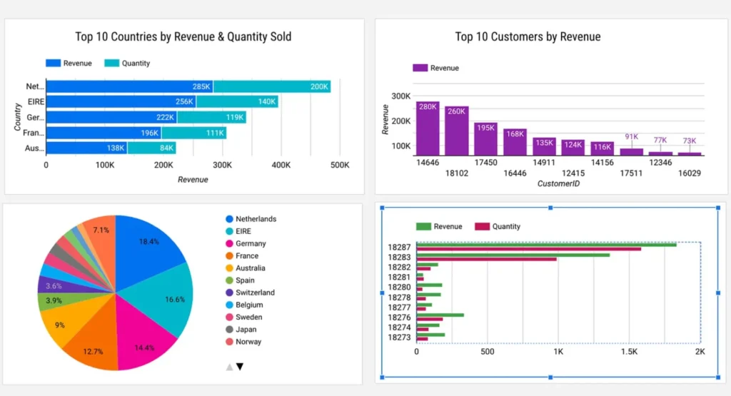
What’s wrong? As shown, there are too many colors, effects, and decorative elements that distract from the actual data.
How to improve it? Keep the design clean and use colors only to highlight important information.
3. Using misleading scales or axes
An inaccurate or poorly chosen scale can make small differences look much bigger or smaller than they really are, which may lead to incorrect conclusions.
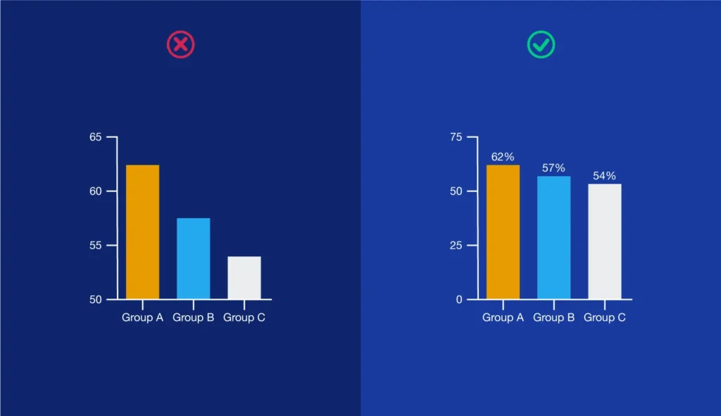
What’s wrong? As shown, the chart on the left exaggerates differences by using an inconsistent or truncated scale.
How to improve it? Use an appropriate and consistent axis so the data is represented accurately, as shown on the right.
4. Including too much information in one chart
When a chart is overcrowded with labels, numbers, or multiple data points, the audience may miss the main point and struggle to understand what matters most.
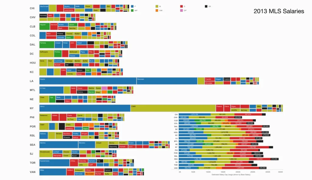
What’s wrong? As shown, the chart is overcrowded, making it difficult to identify the key message.
How to improve it? Simplify the visualization by focusing on the most important data or splitting it into multiple charts.
5. Choosing the wrong level of detail for the audience
A chart that works well for analysts may be too detailed for executives or other non-technical viewers, so the level of detail should always match the audience.
In this case, keeping charts simple and focused makes them easier to understand and more useful for decision-making.
Best Practices
Creating effective visualizations involves more than selecting a chart type. The following practices can significantly improve clarity and impact:
- Keep it simple: Avoid clutter so the main message stands out clearly.
- Choose the right chart: Match the chart to the type of information being shown and the question being asked.
- Use colors wisely: Keep colors consistent, and use them to highlight important points rather than decorate the chart.
- Label clearly: Clear titles, axis labels, and units make charts easier to understand.
- Keep data accurate: Charts are only useful if the data behind them is correct and up to date.
- Have a clear purpose: Each chart should answer a specific business question and support a decision.
Following these practices makes reports more useful and easier to understand.
Applying these best practices is even more effective when paired with a structured data analysis process. Learn more about our Data Analysis services at Data2Stats and how we help organizations transform data into actionable business insights.
Conclusion
Data visualization has become an essential component of modern business intelligence. As organizations continue to collect larger volumes of data, the ability to transform that information into meaningful insights becomes increasingly valuable.
Effective visualizations simplify complex information, reveal hidden patterns, and enable decision-makers to identify opportunities and risks more quickly. Whether through bar charts, line graphs, heat maps, or interactive dashboards, visualization helps bridge the gap between raw data and strategic action.
However, effective visualization is more than creating attractive charts. It requires choosing the right visuals, presenting accurate data, and telling a clear story that supports decision-making. When used properly, data visualization helps businesses communicate insights more effectively and make smarter, evidence-based decisions in today’s data-driven world.
Overall, data visualization transforms raw data into actionable insights that support better business decisions. If you’d like to continue learning, explore our Data Analysis page at Data2Stats to discover practical examples of how data analysis and visualization are applied to solve real business challenges.