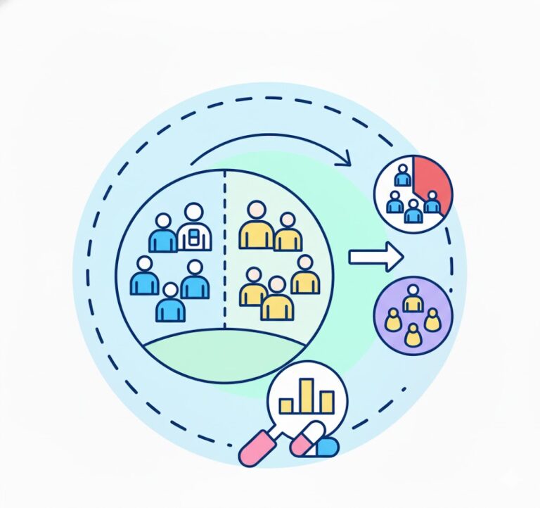
Illustration showing the flow of generating daily pulse report from data source to output.
Introduction
In fast-moving businesses, waiting for weekly or monthly reports is no longer enough. Leaders and operators need quick visibility into how the business is performing today. A Daily Pulse Report provides that snapshot by tracking key performance metrics such as revenue, ad spend, and efficiency ratios in one concise view.
By using BigQuery’s Data Canvas, teams can transform raw data into a structured report that updates automatically and highlights the most important signals of business health. This guide walks through how to build a Daily Pulse Report in BigQuery that turns complex datasets into actionable insights for faster, more confident decisions.
What is the Daily Pulse Report?
A Daily Pulse Report is a concise business report that provides a quick snapshot of an organization’s performance on a given day. It focuses on a small set of critical metrics that reflect the overall health of the business, allowing leaders and teams to quickly understand whether performance is improving, stable, or declining.
The term “pulse” comes from the idea of checking vital signs. Just as a doctor checks a patient’s pulse to assess their condition, a Daily Pulse Report helps businesses regularly monitor their key indicators. Instead of reviewing long and complex reports, decision-makers can rely on a simple summary that highlights the numbers that matter most.
These reports typically include metrics such as revenue, marketing spend, conversion performance, and efficiency ratios, often paired with short time-based comparisons like month-to-date or last seven days to provide context and reveal trends.
The main goal of a Daily Pulse Report is to support faster, data-driven decisions. By reviewing these metrics daily, teams can quickly detect changes in performance and respond before small issues become larger problems.
Data Canvas in Google Big Query
BigQuery Data Canvas, a feature powered by Gemini in BigQuery, enables users to discover, transform, query, and visualize data using natural language prompts alongside a graphical workflow interface.
It uses a directed acyclic graph (DAG) to represent analysis workflows, allowing you to visually map each step of your process. This setup makes it easy to iterate on query results and explore multiple analytical paths within a single workspace.
Data Canvas is designed to speed up analytics and support data professionals—such as analysts and engineers—in turning data into insights. While it doesn’t require deep technical expertise, a basic understanding of SQL is still helpful. It also integrates with Dataplex Universal Catalog to identify relevant datasets based on natural language queries.
What you can do with Data Canvas:
- Use natural language queries to find assets such as tables, views, or materialized views.
- Use natural language for basic SQL queries such as the following:
- Queries that contain FROM clauses, math functions, arrays, and structs.
- JOIN operations for two tables.
- Create custom visualizations by using natural language to describe what you want.
- Automate data insights.
Incorporating AI into Generating Insights
While BigQuery’s Data Canvas provides automated data insights, its outputs can sometimes be limited in flexibility and customization. In some cases, it may not fully support specific analytical needs when the results generated are aggregated (e.g. total revenue for March 2025). In these situations, leveraging other AI tools can be beneficial. By combining Data Canvas with additional AI-driven platforms, users can enrich their analysis, generate deeper insights, and develop more meaningful and actionable recommendations.
Advantages of using AI in building insights and recommendations
- AI delivers near real-time insights, enabling quicker responses to performance changes, anomalies, or emerging trends.
- Reduces time spent on manual data analysis, allowing teams to focus on strategy and execution.
- Provides data-driven insights based on actual performance rather than assumptions or intuition.
- Provides consistent, automated tracking of key metrics (e.g., revenue, spend, conversions) without manual intervention.
- Identifies hidden trends, correlations, and anomalies that may not be immediately visible through manual analysis.
Disadvantages of using AI in building insights and recommendation
- AI may generalize complex situations, missing nuances that require deeper human analysis.
- Recommendations still need human review to ensure they are practical, relevant, and aligned with business goals.
- Handling sensitive business or customer data requires strict controls, and misuse or misconfiguration can pose risks.
- Over-reliance on AI can reduce critical thinking and lead teams to act on insights without proper scrutiny.
- AI may flag normal fluctuations as issues, creating unnecessary alerts or distractions.
While AI offers numerous benefits, its use also presents certain drawbacks that can impact the quality of outputs. Although AI can generate comprehensive insights and recommendations, human involvement remains essential for validation and fact-checking. It should be used as a support tool rather than a complete replacement for human judgment.
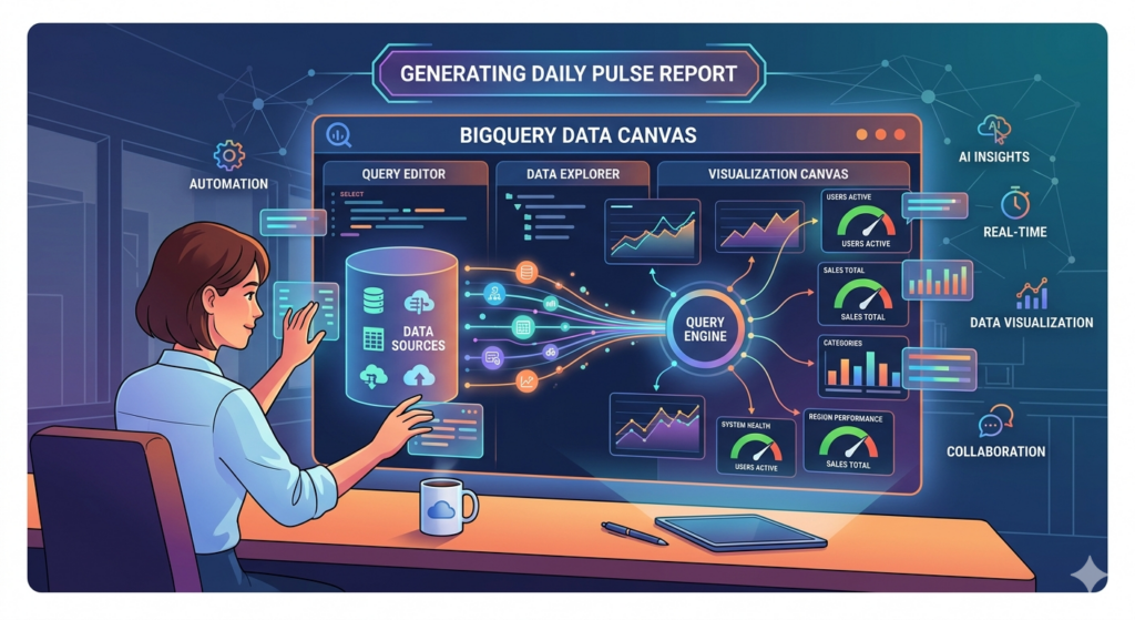
Generating Daily Pulse Report in Big Query Data Canvas
In data canvas, aside from generating values for the daily pulse, it is also possible to build its template. This guide will walk you through the ff. steps:
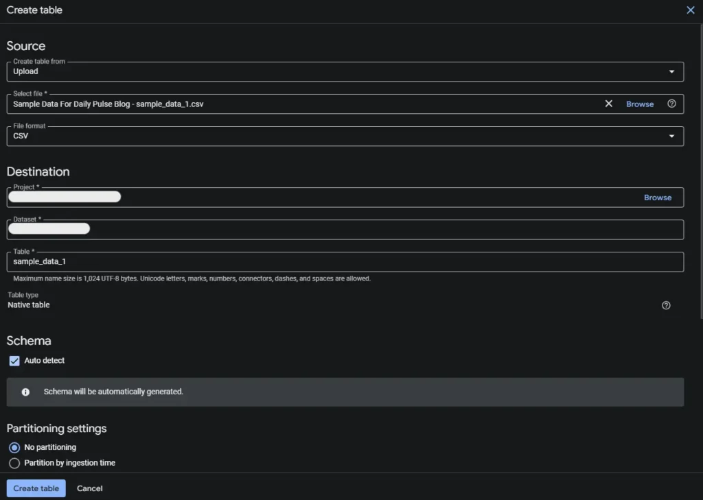
- Prepare the dataset within BigQuery. There are different ways to load the data or create a table in GBQ’s dataset. In this guide, we’ll load the data via upload as a .csv file.
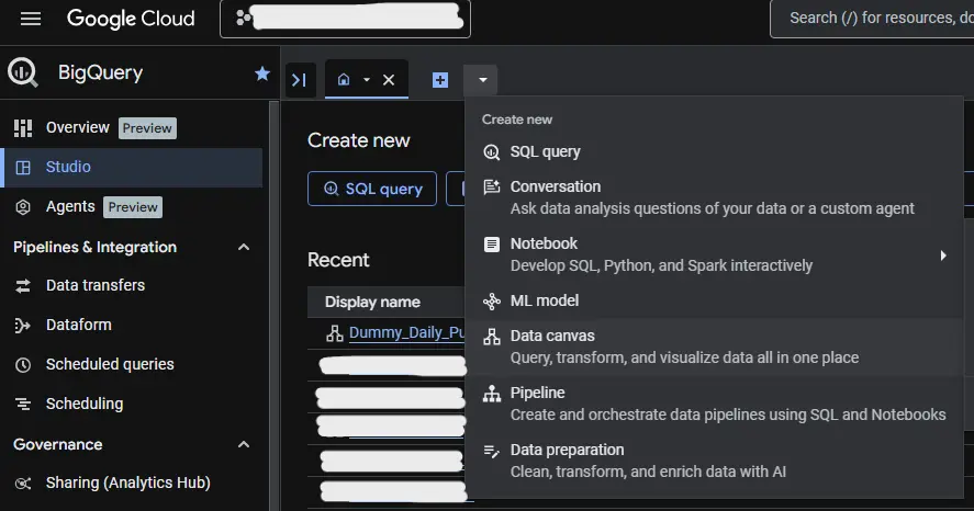
2. In Big Query’s Studio, click the Data Canvas in the dropdown arrow to open a blank canvas.
3. Rename your canvas.

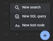
4. Click the New search from the Add Node button to add your dataset/s.
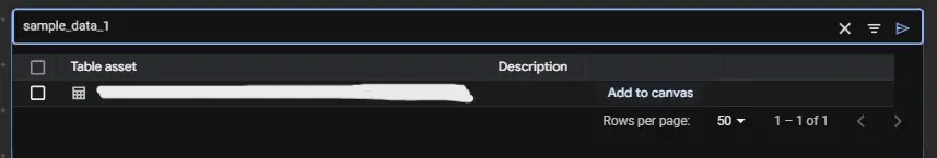
5. Place the search in the canvas and search for your dataset and Ad to canvas.
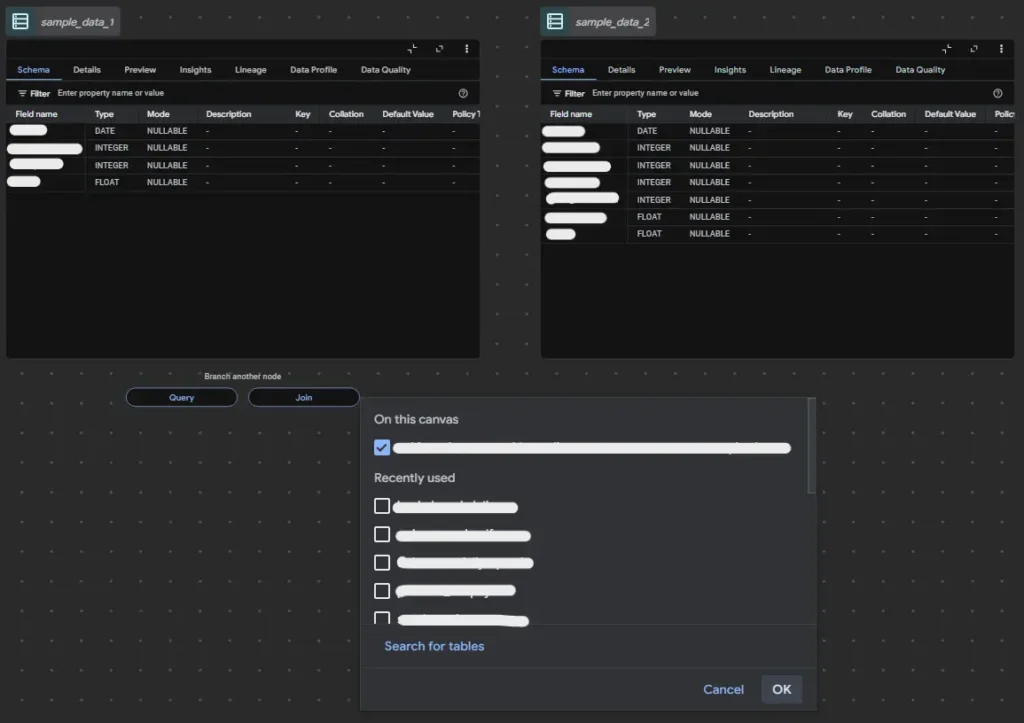
6. (Optional Step) Join the tables to merge the data in one SQL. Note: tables and SQLs can be renamed.
7. Remove the current query. In the refine bar of SQL, describe how you want to view your data. Sample prompt can be, “Find the month to date and last 7 days data of revenue and spend and label as mtd_revenue, mtd_ad_spend, l7d_revenue, l7d_spend. ”. You may refine the query multiple times until the desired query is achieved.
8. To integrate a query for templating your daily pulse. Here’s a sample query for generating the template, just add it to your existing code.
 -- ========== FORMATTED SUMMARY ==========
  CONCAT(
    ‘Daily Pulse - ',
    FORMAT_DATE('%d %b %Y', today_date), '\n\n',


    'MTD: ',
    FORMAT_DATE('%b %d, %Y', mtd_start),
    ' - ',
    FORMAT_DATE('%b %d, %Y', end_date), '\n',


    'Last 7D: ',
    FORMAT_DATE('%b %d, %Y', last7_start),
    ' - ',
    FORMAT_DATE('%b %d, %Y', end_date), '\n\n',


    '• Revenue: MTD: $',
    FORMAT("%'.2f", CAST(mtd.revenue AS FLOAT64)),
    ' | Last 7D: $',
    FORMAT("%'.2f", CAST(last7.revenue AS FLOAT64)), '\n',

    '• Spend: MTD: $',
    FORMAT("%'.2f", CAST(mtd.spend AS FLOAT64)),
    ' | Last 7D: $',
    FORMAT("%'.2f", CAST(last7.spend AS FLOAT64)), '\n',


    '• MER: MTD: ',
    FORMAT('%.2f', SAFE_DIVIDE(CAST(mtd.revenue AS FLOAT64), CAST(mtd.spend AS FLOAT64))),
    ' | Last 7D: ',
    FORMAT('%.2f', SAFE_DIVIDE(CAST(last7.revenue AS FLOAT64), CAST(last7.spend AS FLOAT64))), '\n'


) AS SUMMARY


FROM mtd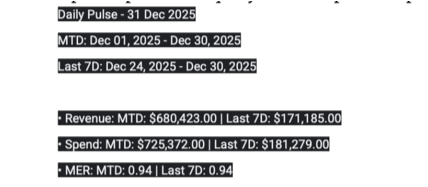
CROSS JOIN last7;The sample output of this query can be copied and pasted and will look like this.
9. Now that the template for daily pulse is built, you may paste it to your preferred AI platform to start generating insights and recommendations.
Conclusion
Daily pulse reports are quick and straightforward to produce, but they can become tedious and time-consuming when data has to be manually gathered every day, especially when working with hundreds or even thousands of records.
Data Canvas in BigQuery is a dynamic feature that allows users to seamlessly organize and build analyses, from raw data sources to fully developed visualizations. By automating reports such as daily pulse, businesses can significantly reduce the time spent on data collection and instead focus on generating insights and delivering actionable recommendations.
At Data2Stats Consultancy Inc., we provide accurate and reliable reporting through systemized processes. By integrating powerful tools into our workflow, we ensure that fast-paced reporting keeps up with business demands without compromising accuracy or depth of insight.