
Introduction
In the ever-changing field of medical diagnostics, researchers have continuously exceeded expectations from the discovery of X-rays to the rise of using Artificial Intelligence-assisted tracing of brain tumor markers. We always strive towards giving accurate and accessible diagnostic tools for the masses.
But really, how do they even validate the accuracy of these tests and models? This is where logistic regression in R becomes a powerful ally for clinicians and data scientists alike.
Instead of just eyeballing cutoffs or computing 2×2 matrices, logistic regression let’s you model the relationships between your test and the disease status, generate predicted probabilities, and then derive evaluation matrices like sensitivity, specificity, positive predictive value (PPV), negative predictive value (NPV), ROC curves, and AUC in a single, coherent workflow.
In this article, we will be exploring the rationale behind the use of logistic regression, and walk you through the workflow itself in R.
Logistic regression in medical research
In a typical diagnostic accuracy study, you compare a new test (index test) against a reference standard (e.g., biopsy result, gold standard imaging like DXA scans, MRI, established clinical criteria). From this, we usually have two outcomes; disease or no disease.
Logistic regression is designed exactly for this situation. As what Sperandei (2021) defined, logistic regression works very similarly to linear regression but uses a binomial response variable. Compared to the traditional Mantel-Haenszel odds ratio, it can handle continuous explanatory variables and multiple predictors simultaneously.
Translating this to medical research, this means that this method fits perfectly as diagnostic performance rarely depends on a single factor. By allowing several variables (like age, sex, and biomarker levels) be analyzed together, logistic regression accounts for covariance and confounding effects, providing a more realistic picture of how we really diagnose in a clinical setting.
Logistic Regression in R
In R, this is implemented via the glm() function with family = binomial, which fits a generalized linear model for binary data.
Compared with a simple 2×2 table at a single cut-off, logistic regression in R:
- Uses all available information (especially if your test is continuous).
- Can adjust for covariates (e.g., age, sex, comorbidities).
- Gives predicted probabilities, which can be turned into different cut-offs and ROC curves.
- Integrates naturally with R packages for metrics (e.g., pROC for ROC/AUC, yardstick for sensitivity, specificity, PPV, NPV).
At D2S, our Statistical Consulting for Research ensures that your sampling strategy is scientifically sound, tailored to your goals, and aligned with international research standards.
Data Collection
In any diagnostic accuracy study, your results are only as strong as the data you collect. For this tutorial, we are going to simulate a hospital-based study validating a new risk score called HeartRisk Score, designed to predict heart disease presence. Each participant undergoes both the index test (HeartRisk Score) and the reference standard (the cardiologist’s final diagnosis).
We simulated a 400-patient dataset to demonstrate the workflow. With the following variables included,
| Variable | Description | Type | Example |
| id | Patient ID | Integer | 101 |
| age | Age in years | Numeric | 56 |
| sex | Biological Sex | Categorical | Male |
| smoker | Smoking Status (1 = Yes, 0 = No) | Binary | 1 |
| sys_bp | Systolic Blood Pressure (mm Hg) | Numeric | 140 |
| chol | Total Cholesterol (mg/dL) | Numeric | 220 |
| heart_risk_score | Index Test Result (continuous 0-100) | Numeric | 72.4 |
| disease | Reference Outcome (1 = Heart disease present, 0 = Absent) | Binary | 1 |
Table 1. Sample Dataset
We included age, and smoking status as predictors as these increase the likelihood of disease.
Data Analysis
Once data is collected, researchers immediately conduct Exploratory Data Analysis (EDA) to make a quick sense of the data collected. Here’s how they do it in R.
Step 1. Open R Studio.
Step 2. Load the Data.
Paste and run the code below to upload the CSV file containing your dataset from your local device. If your file has a different name, update the file name in the code accordingly.
diag_data <- read.csv("/Users/james/heart_data_dummy.csv", header = TRUE)Step 3. Conduct a quick look at the data
See first few rows
head(diag_data)Output:

Fig 1. First few rows of the dataset in R.
Check structure: variable types and names
str(diag_data)Output:

Fig 2. Variable types and names of the dataset in R.
Get basic summary statistics
summary(diag_data)Output:
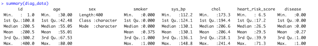
Fig 3. Result of summary statistics computed in R.
Interpretation:
The dataset includes 400 patients aged 30–80 years (mean ≈ 55), with about 37% identified as smokers. Average systolic blood pressure and cholesterol levels are 130 mm Hg and 206 mg/dL, respectively, while the mean HeartRisk Score is 29.5. Roughly 27% of participants have heart disease.
Check outcome distribution
table(diag_data$disease)
prop.table(table(diag_data$disease))Output:
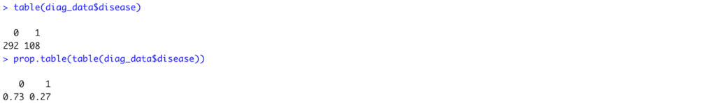
Fig 4. Outcome distribution of the disease in R.
Interpretation:
Out of 400 patients, 108 (27%) were diagnosed with heart disease, while 292 (73%) had no disease. This indicates a moderate disease prevalence.
Inspect the Index Test: HeartRisk Score
# Overall distribution
hist(diag_data$heart_risk_score,
     main = "Distribution of HeartRisk Score",
xlab = "HeartRisk Score")Output:
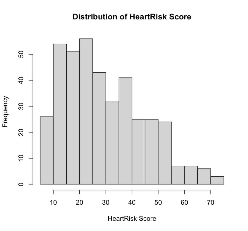
Fig 5. Distribution of HeartRisk Score in R.
Interpretation:
The HeartRisk Score is slightly right-skewed, with most patients scoring between 15 and 40. This suggests that lower to mid-range scores are more common in the sample, while very high scores are relatively rare.
# Distribution by disease status
boxplot(heart_risk_score ~ disease, data = diag_data,
        xlab = "Disease Status (0 = No, 1 = Yes)",
        ylab = "HeartRisk Score",
main = "HeartRisk Score by Disease Status")Output:
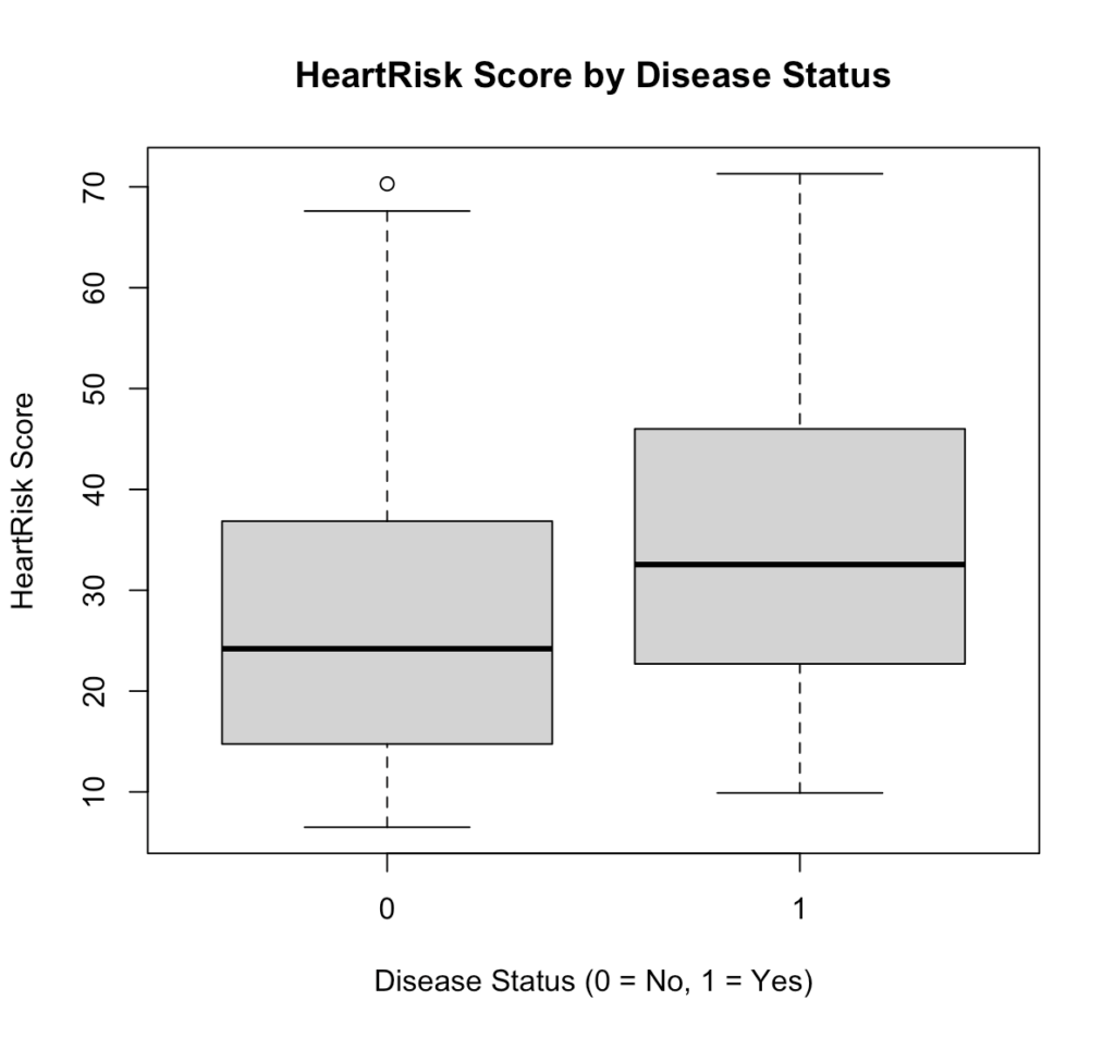
Fig 6. HeartRisk Score by Disease Status in R.
Interpretation:
Patients with heart disease (1) generally have higher HeartRisk Scores than those without (0), indicating that the test can effectively distinguish between diseased and non-diseased individuals.
Look at Relationships Between Predictors
pairs(~ age + sys_bp + chol + heart_risk_score, data = diag_data)Output:
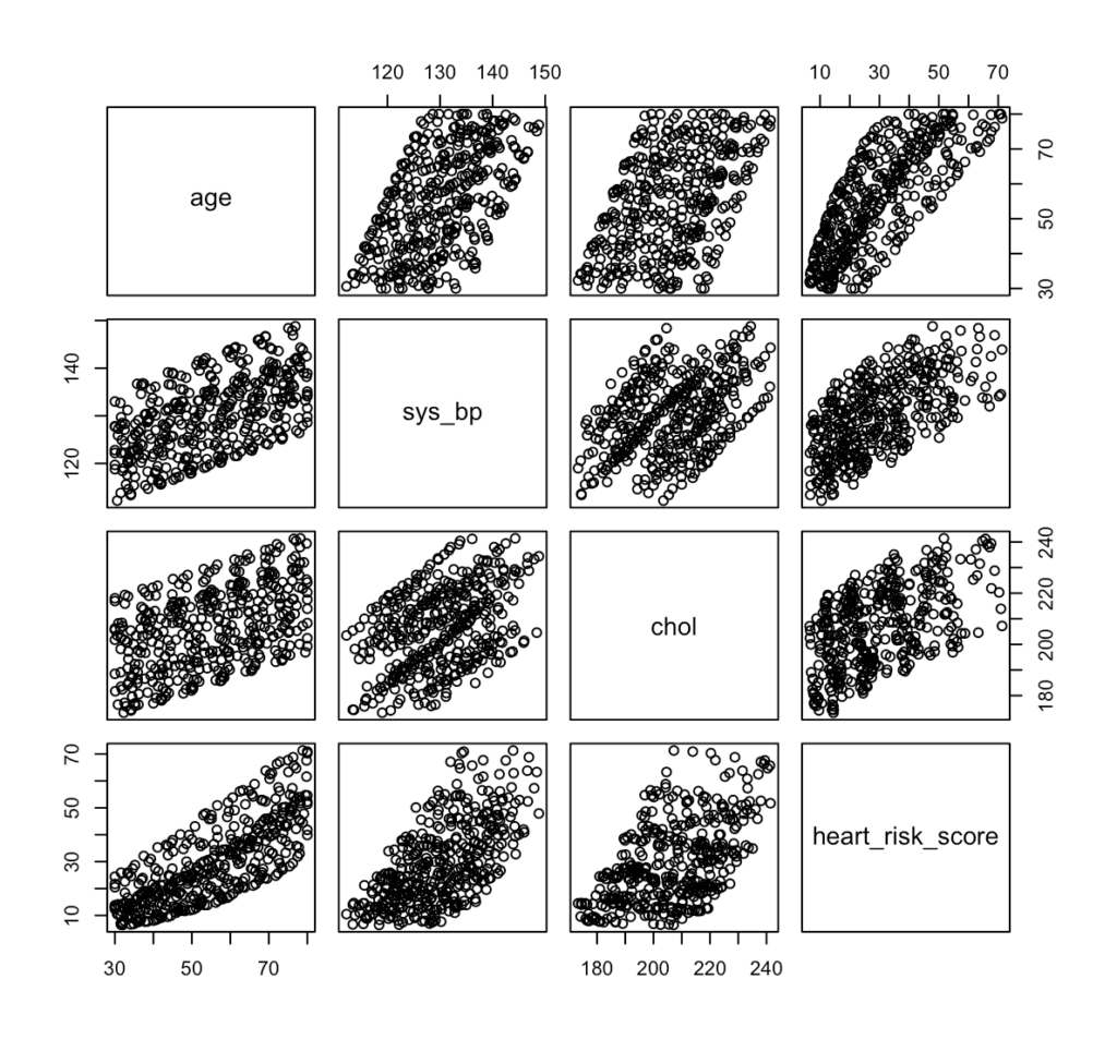
Fig 7. Pair plot of risk predictors, such as age, systolic blood pressure, cholesterol, and HeartRisk Score in R.
Interpretation:
The pair plot shows strong positive relationships among age, systolic blood pressure, cholesterol, and HeartRisk Score, meaning that as one increases, the others tend to increase as well. This suggests that the HeartRisk Score appropriately reflects cardiovascular risk factors, but the visible correlations also highlight the need to check for multicollinearity when fitting the logistic regression model.
After completing the EDA and checking all the necessary requirements, we’re now ready to proceed to next steps. Data2Stats’ Data Analysis service applies advanced statistical models and modern techniques, helping you uncover insights that go beyond surface-level findings.
Step 4. Data SplittingFor data splitting, we use 80:20 split of our 400 patients for our training and test set. To maintain the same proportion of patients with and without heart disease across both subsets, we applied stratified sampling. Using the caret package in R, we have
library(caret)
set.seed(123)
split <- createDataPartition(diag_data$disease, p = 0.8, list = FALSE)
train_data <- diag_data[split, ]
test_data  <- diag_data[-split, ]
prop.table(table(train_data$disease))
prop.table(table(test_data$disease))Output:
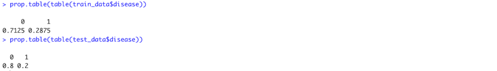
Fig 8. Distribution of the disease prevalence after splitting in R.
Step 5. Fitting Logistic RegressionUsing the training set and the glm() function with family = binomial, we have
model_adj <- glm(
  disease ~ heart_risk_score + age + sex + smoker,
  data   = train_data,
  family = binomial
)
summary(model_adj)
Fig 9. Model Summary of the Adjusted Logistic Regression Model to accommodate all predictors in R.
Interpretation:
After adjusting for age, sex, and smoking status, only age remained a statistically significant predictor of heart disease (p = 0.019). Each one-year increase in age raises the log-odds of heart disease by about 0.04, or roughly a 4% increase in odds. The HeartRisk Score, sex, and smoking status showed no statistically significant associations in this model.
# Odds ratios and confidence intervals
exp(coef(model_adj))
exp(confint(model_adj))Output:
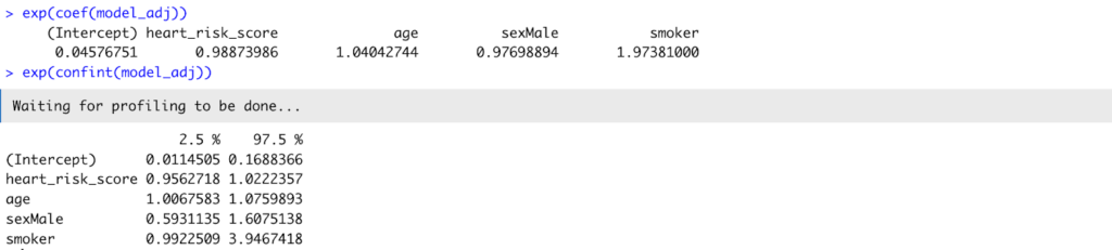
Fig 10. Odds ratio and confidence interval of the model_adj.
Interpretation:
Translating coefficients into odds ratios, age had an OR = 1.04 (95% CI: 1.01–1.08), confirming its significant positive relationship with disease. The HeartRisk Score (OR = 0.99, 95% CI: 0.96–1.02) was not statistically significant, suggesting that once age and smoking were considered, the HeartRisk Score did not independently predict disease in this sample.
Step 6. Evaluation Metrics
Generate Predicted Probabilities and Generate a Classification Threshold
test_data$pred_prob <- predict(
  model_adj,
  newdata = test_data,
  type = "response"
)


head(test_data$pred_prob)
summary(test_data$pred_prob)Output:

Fig 11. Sample and Summary of the predicted values.
Choose a Classification Threshold
By default, a cutoff of 0.5 is often used (≥ 0.5 = disease, < 0.5 = no disease), but this can be adjusted depending on the study’s clinical priorities.
threshold <- 0.5
test_data$pred_class <- ifelse(test_data$pred_prob >= threshold, 1, 0)Create a Confusion Matrix
A confusion matrix summarizes model predictions versus actual outcomes.
table(Predicted = test_data$pred_class, Actual = test_data$disease)Output:

Fig 13. Confusion Matrix of the test set.
Interpretation:
The model correctly identified most non-diseased patients but missed many true disease cases, suggesting under-detection at the 0.5 threshold.
Compute Sensitivity, Specificity, PPV, and NPV
library(yardstick)


test_data_factor <- test_data |>
  dplyr::mutate(
    disease = factor(disease, levels = c(0, 1)),
    pred_class = factor(pred_class, levels = c(0, 1))
  )


sens(test_data_factor, truth = disease, estimate = pred_class)
spec(test_data_factor, truth = disease, estimate = pred_class)
ppv(test_data_factor, truth = disease, estimate = pred_class)
npv(test_data_factor, truth = disease, estimate = pred_class)Output:
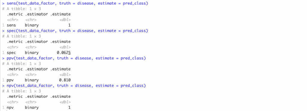
Fig 13. Sensitivity, Specificity, PPV, and NPV computation results in R..
Interpretation:
Sensitivity was 1.00, specificity 0.06, PPV 0.81, and NPV 1.00—indicating high certainty for negatives but poor balance overall.
Plot the ROC Curve and Compute AUC
library(pROC)
roc_obj <- roc(response = test_data$disease,
               predictor = test_data$pred_prob)
plot(roc_obj, print.auc = TRUE,
     main = "ROC Curve for Logistic Regression Model")
auc(roc_obj)Output:
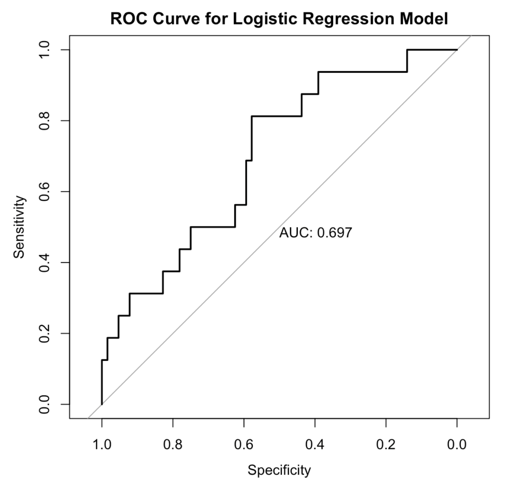
Fig 14. ROC/AUC Curve, generated in R.
Interpretation:
The model shows fair discrimination, correctly distinguishing diseased from non-diseased patients about 70% of the time.
Pitfalls and Best Practices
Even though logistic regression is a powerful and interpretable tool, researchers should be aware of few common pitfalls when using it for diagnostic accuracy studies.
Unbalanced Data. When one outcome (e.g., “no disease”) heavily outweighs the other, models can appear accurate but fail to detect the minority class. That is why it is important to do EDA and, if necessary, apply stratified sampling or resampling methods to balance data.
Multicollinearity. Highly correlated predictors can inflate standard errors and distort coefficient estimates. Thus, checking correlation plots or Variance Inflation Factors (VIF) should be done before modeling.
Overfitting. Including too many predictors in small datasets may produce overly complex models that perform well in training but poor on new data. A good rule of thumb is 10-15 events per predictor variable.
Threshold Dependence. Metrics like sensitivity and specificity change depending on the chosen cutoff. Use ROC analysis to determine the optimal threshold rather than defaulting to 0.5.Ignoring Clinical Context. A statistically strong model is not necessarily clinically useful. Always interpret diagnostic performance in light of clinical priorities — such as minimizing false negatives in screening tests.
Conclusion
Through this walkthrough, we showed logistic regression in R bridges that question — transforming raw test data into measurable evidence of diagnostic accuracy. By deriving sensitivity, specificity, PPV, NPV, and ROC/AUC, researchers can move beyond intuition and quantify how well their tool distinguishes disease from health.
In essence, the same spirit that drives innovation in diagnostics must also drive rigor in validation. That’s where Data2Stats thrives—bridging medical research and statistical excellence to help transform good ideas into validated, evidence-based solutions.